Almost every bar breaks the previous bar’s high or low. That part is easy. The hard part — the part that actually costs traders money — is knowing whether a break is going somewhere, or whether it’s a fake that’s about to snap back.
So we ran the numbers. Twelve years of NQ and ES futures (2014–2026), across six timeframes — 1H, 4H, 8H, 12H, Daily and Weekly — measuring three things: how often price breaks the prior bar’s range, how far it runs once it does, and whether there’s a reliable way to tell a real breakout from a false one. There is. Here’s what the data shows.
One note on how to read this: we illustrate with NQ for clarity — the charts and the worked example are on the Nasdaq contract — and we confirm every headline number on ES. When two different instruments land on the same figure, that’s a strong sign the pattern is real, not curve-fit to one market. The ES numbers sit in the tables alongside NQ.
The three-second summary
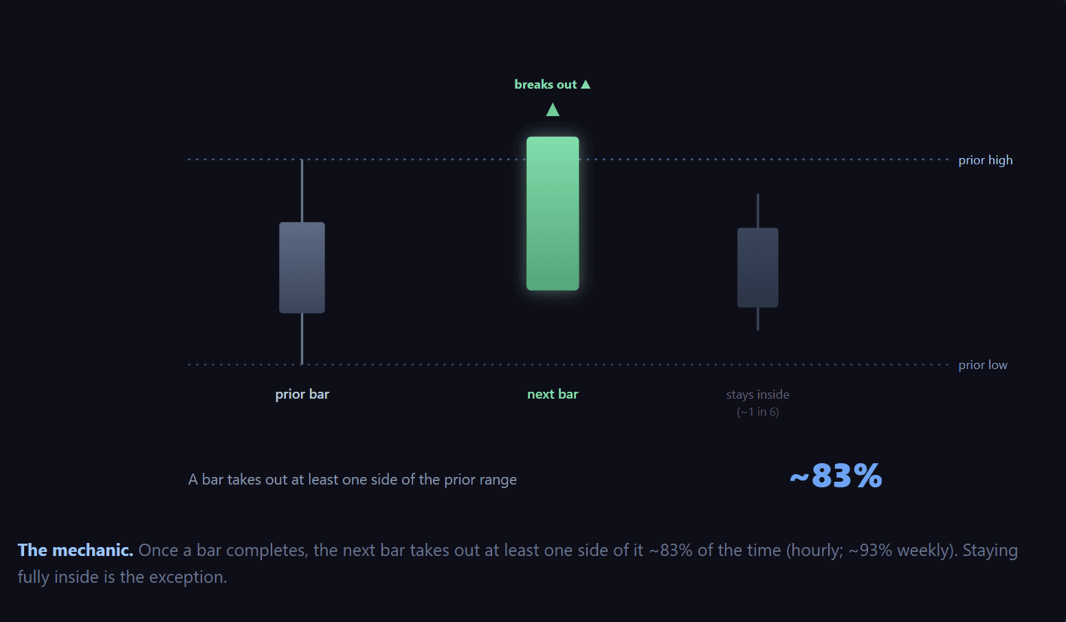
- A bar breaks at least one side of the prior bar’s range more than 80% of the time — around 82% on the hourly, rising to ~93% on the weekly. Staying fully inside is the exception.
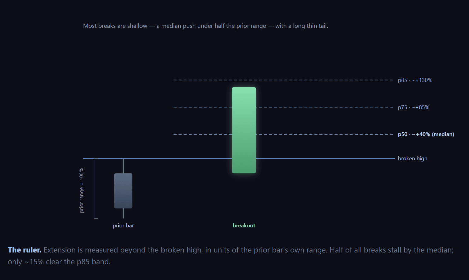
- Once it breaks the high, the typical (median) run is about 40% of the prior bar’s own range beyond the level. Deep runs are rare — only ~1% travel more than ~2–4× the prior range.
- The useful part: a break that stalls short of that typical run fails back inside ~65% of the time. A break that pushes past it holds ~4 times out of 5. That one split is stable across all six timeframes on both NQ and ES.
How we measure “how far.” Raw points don’t compare across days — a 100-point move on a wild day and a 100-point move on a quiet day mean completely different things. So we measure a break’s extension as a percentage of the prior bar’s range (its high minus its low). If yesterday ranged 200 points and today pushes 80 points above its high, that’s a 40% extension. This puts every bar, quiet or wild, NQ or ES, on the same ruler.
First: breaking the range is normal
Before “how far,” the base rate. For every completed bar, we checked whether the next bar traded through the prior high, the prior low, or stayed fully inside.
| Timeframe | Break prev HIGH | Break prev LOW | Stayed fully inside |
|---|---|---|---|
| 1H | ~49% | ~44% | ~17–18% |
| 4H | ~52% | ~44% | ~18% |
| 8H | ~54% | ~45% | ~18% |
| 12H | ~54% | ~44% | ~20% |
| Daily | ~57% | ~43% | ~12% |
| Weekly | ~63% | ~41% | ~7% |
NQ and ES land within a point or two of each other on every row. Note the weekly asymmetry — 63% break the prior high vs 41% the low. Twelve years of equity drift, printed straight into the base rates.
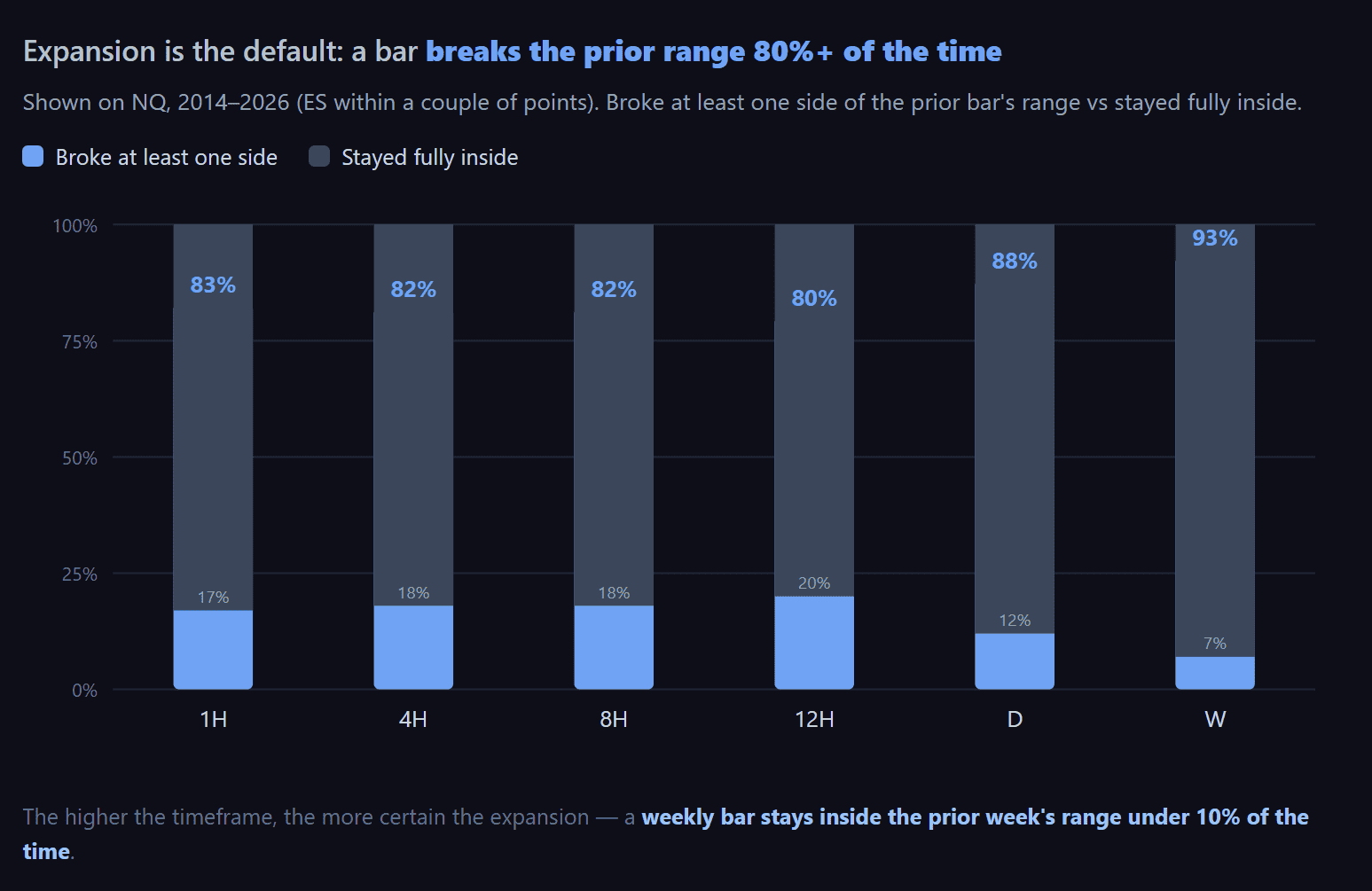
This is the first lesson, and it’s the one most breakout traders get wrong: a break of the prior high, by itself, tells you almost nothing. It happens four times out of five. If your entire signal is “price broke yesterday’s high,” you’re acting on the single most common thing a market does. The edge isn’t in the break — it’s in what comes after.
How far does a break actually run?
When a bar breaks the prior high, how far does it push beyond it? Here’s the distribution, in “% of the prior bar’s range”:
| Timeframe | Median (p50) | p75 | p85 | Rare (p99) |
|---|---|---|---|---|
| NQ 1H | 39% | 75% | 105% | 335% |
| NQ 4H | 43% | 84% | 119% | 342% |
| NQ Daily | 36% | 70% | 91% | 214% |
| ES 1H | 40% | 75% | 100% | 307% |
| ES 4H | 42% | 81% | 114% | 328% |
| ES Daily | 36% | 68% | 87% | 239% |
Quick refresher on percentiles. The median (50th) is the middle: half of all breaks run less than this, half run more. The 85th percentile is the level only 15% of breaks ever exceed. So “p85 = 91%” means only 15 out of 100 daily breaks push more than ~0.9× the prior day’s range past the high.
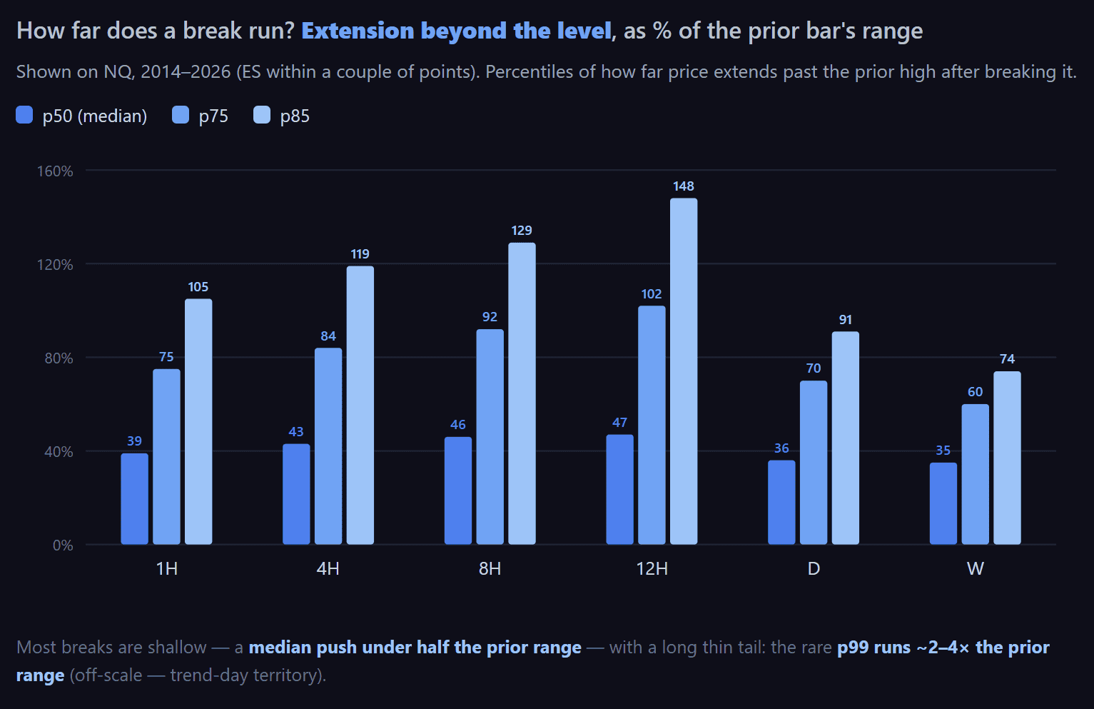
The shape is the same on every timeframe and both instruments: most breaks are shallow, and the big ones are rare. Half of all breaks fizzle out before running even half the prior bar’s range. That’s the raw material for the one thing in this study you can actually use.
The fakeout line
Here’s the finding. We split every breakout into two groups — those that cleared the median run (~40% of the prior range) and those that stalled short of it — and measured how often each one failed, meaning the bar closed back inside the prior range.
A break that can’t clear the median run fails back inside the range about two-thirds of the time. A break that clears it holds roughly four times out of five.
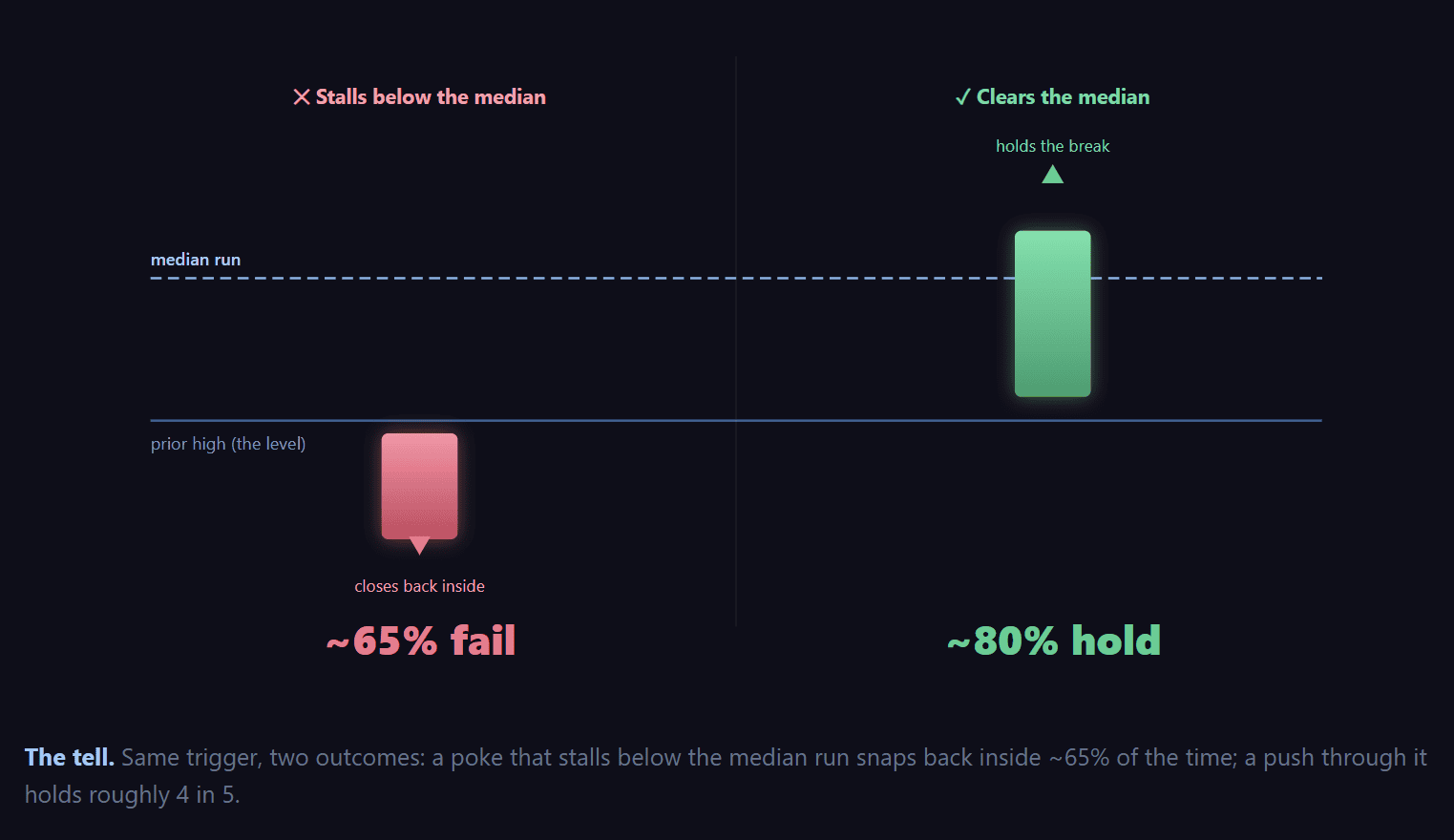
And this isn’t a quirk of one timeframe. The gap sits at ~45 percentage points on every timeframe, on both NQ and ES:
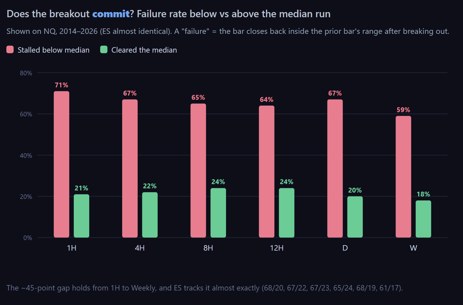
In plain terms: a breakout that hasn’t committed past the typical run is far more likely to be a fake. The market pokes above the level, fails to follow through, and slides back in. The breaks that keep going are the ones that clear the median early and never look back.
And it works both ways. Everything above is measured on breaks of the prior high, but the downside behaves the same — if anything, a touch more sharply. A break of the prior low that stalls short of the median run fails back inside ~73–79% of the time, versus ~25% for one that pushes through. The commitment test isn’t a long-only quirk; it reads failed breaks in either direction.
It’s not just how often — it’s how far
Failure rate is one number; the size of the outcome is another. So we measured where each breakout’s bar actually closes relative to the level it broke — in prior-range units — split by whether it cleared the median run. This is where the finding stops being a curiosity and starts being an edge.
| After breaking the prior high… | Fails back inside | Average close vs the level |
|---|---|---|
| Stalled below the median run | ~65–71% | −28% of prior range (finishes back below) |
| Cleared the median run | ~17–21% | +45% of prior range (holds above) |
The two states close about three-quarters of a full prior-range apart — and on opposite sides of the line. A break that never reached the median run tends to finish the bar back below where it broke; one that cleared it finishes deep in positive territory. Same split on the hourly and on ES.
That’s the difference between a commitment and a poke expressed in points, not just probabilities. Part of it is still mechanical — a bar that traded higher is likelier to close higher — but the sign flip and the ~75%-of-range gap are what make it worth watching in real time.
What this looks like on a real chart
Two back-to-back NQ days — Thursday and Friday. Same setup, same market, one day apart. Opposite outcomes. And the twist: the very high that rejected price on Thursday became the launch pad it broke on Friday. The median run called both. The bands drawn on each chart are our Prisma quantile zones — the highlighted Median line is the commitment level from this study.
✕ The fake — Thursday
NQ — May 7, 2026
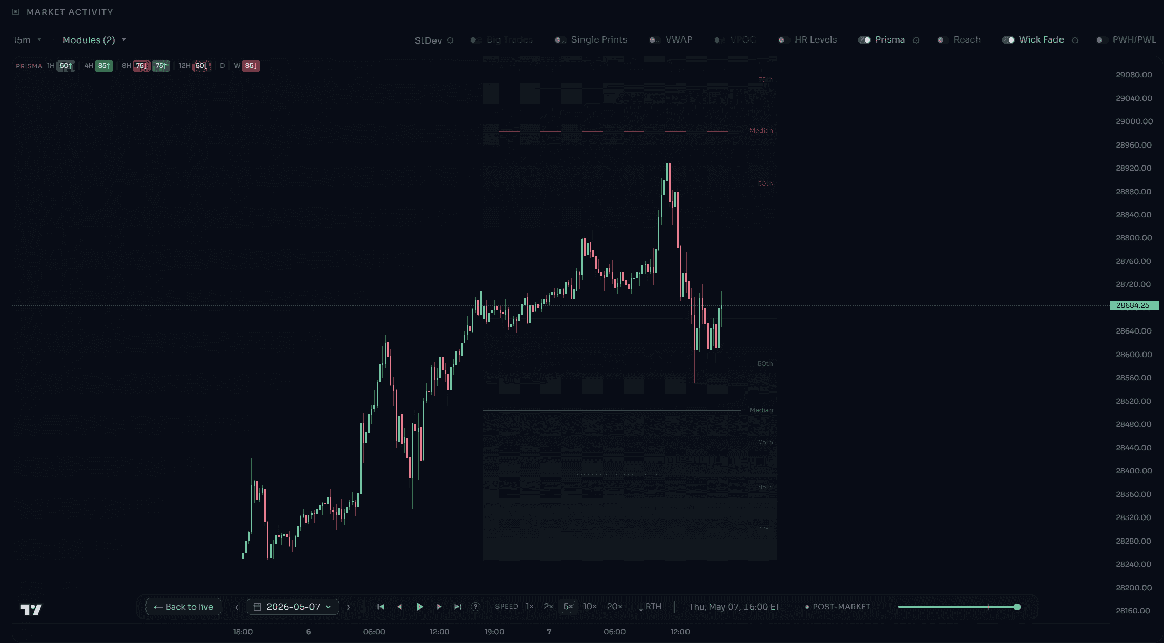
Prior day ranged 557 pts (high 28,800). The median run is ~40% of that ≈ +223 pts. Price poked above to 28,945 — only +145 pts past the high (26%). It tagged the 50th band but stalled below the Median. Result: it rejected and closed at 28,663, back below the prior high. A textbook false break.
✓ The real one — Friday
NQ — May 8, 2026
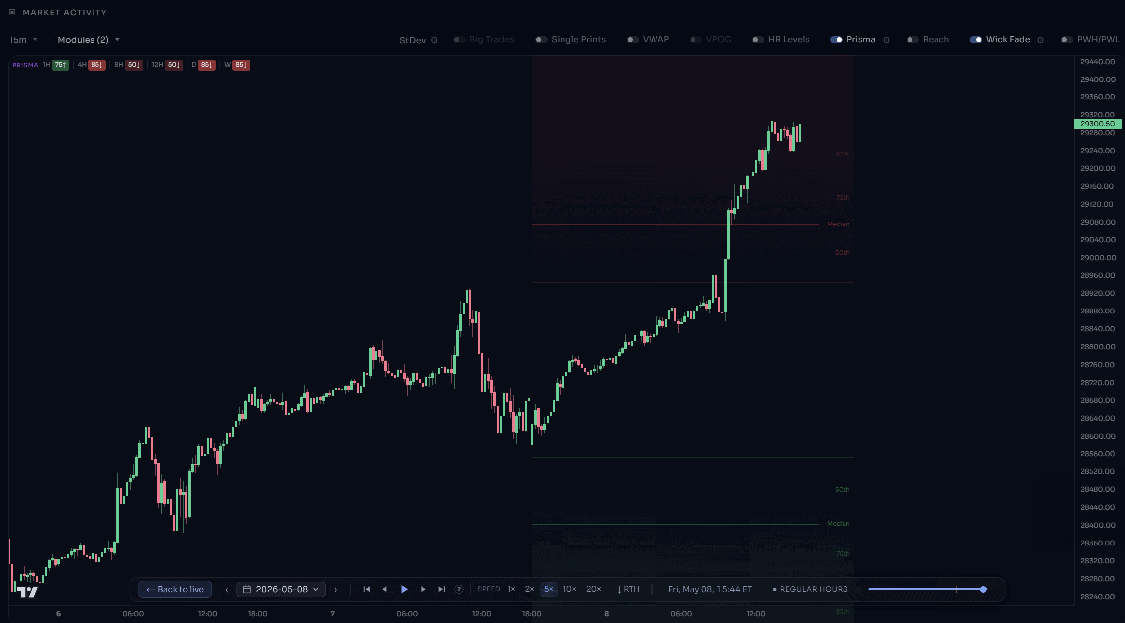
Prior day ranged 393 pts (high 28,945 — Thursday’s rejection high). Median run ≈ +157 pts. Price broke out and ran to 29,352 — +408 pts past the high (104%), blowing straight through the Median and into the 85th band. Result: it closed at 29,335, holding near the high. A genuine expansion.
Same trigger, opposite result — and you could tell them apart in real time by one question: did the break clear the median run, or stall short of it? Thursday’s poke never committed. Friday’s break didn’t hesitate.
Being honest about the “why”
Part of this effect is mechanical, and we won’t pretend otherwise: a bar that only pokes a few points above the prior high is, by definition, sitting close to it — so it’s easier for it to slip back below by the close. We are not claiming the median is a magic level where the market turns around.
What makes it worth using is that the split is sharp and stable. It’s a clean step at the median — not a gradual drift — and it repeats across twelve years, six timeframes, and two instruments that trade differently. That consistency is what turns a statistical curiosity into a fast, reliable read: has this break committed, or not?
The quiet bars: what happens when price doesn’t break
On the bars that stay fully inside the prior range, price still isn’t random. It reaches, on average, roughly two-thirds of the way toward the prior high before turning back — and it leans a little more toward the prior high than the prior low, most clearly on the daily. A small but persistent upward tilt, the fingerprint of the era’s equity drift showing up even in quiet bars.
How to actually use this
- Stop treating the break as the signal. Price clears the prior high 4 out of 5 times. That alone isn’t information.
- Mark the median run. Take the prior bar’s range, multiply by ~0.4, and project it beyond the broken high (or low). That’s your commitment line.
- Judge the break against it. Stalled short of the median → treat it as likely fake (~65% fail): a spot to fade the stretch or wait, not chase. Cleared it → far more likely real (~80% hold): a break you can lean with.
- Use the deeper bands as targets. The p85 (~0.9–1.5× the prior range, depending on timeframe) is where most moves are already stretched; a run to the p99 (~2–4×) is exhaustion, not an entry.
None of this is a signal to trade blindly. It’s a map of where price has actually gone over twelve years — so you can size, target and time around the odds instead of guessing.
Seeing it live: Prisma & Reach
You don’t have to draw these lines by hand. We built the whole distribution into TradingStats:
- Prisma (Quantile Zones) plots the percentile bands live on any timeframe — the reaction zones inside the prior range and the extension zones beyond it — and flips automatically the moment price breaks out. The median line is highlighted, so the commitment level is always on your chart.
- Reach lays out the post-breakout extension ladder and the odds of a break snapping back to its origin before the bar closes.
Both are calibrated per timeframe from the exact 12-year dataset behind this study
Methodology
- Data: NQ and ES continuous futures, 1-minute bars, 2014–2026.
- Timeframes: 1H, 4H, 8H, 12H, Daily, Weekly. Sub-daily bars aggregated on standard ET session boundaries; Daily/Weekly on the futures session calendar (18:00 ET open).
- Break: the current bar’s high trades above the prior bar’s high (or low below the prior low) — a wick counts; no closing confirmation required.
- Extension: distance the bar runs beyond the broken level, as a % of the prior bar’s range (high − low), so it’s comparable across instruments and volatility.
- Failure: the bar closes back within the prior bar’s range after breaking out.
- Samples: tens of thousands of bars per lower timeframe, down to ~630 weekly bars per instrument.
We report the empirical distribution only; the calibration tables that power the live indicators are proprietary. Past behavior is not a guarantee of future results — this is statistical research, not trade advice. Always manage risk.
FAQ
Does a break of the previous high mean price is going higher?
Not on its own — it happens 80%+ of the time, so it carries little information by itself. The depth of the break is what separates a real move from a fake.
What exactly is the “median run”?
The typical distance a breakout travels past the level — about 40% of the prior bar’s range on most timeframes. Breaks that clear it tend to hold; breaks that stall short of it tend to fail back inside.
Why measure in “% of the prior range” instead of points or ATR?
It makes every day comparable. A 100-point NQ move and a 25-point ES move can be the same “40% of the prior range” — the ratio strips out both the instrument and the day’s volatility.
Does this hold on both NQ and ES?
Yes — every headline number tracks within a couple of points across the two, which is a big part of why we trust it. It also holds from the 1-hour bar up to the weekly.
Is the median a guaranteed reversal level?
No. Part of the effect is mechanical, and it’s a probability, not a rule. Its value is that it’s sharp and stable — a fast read on whether a break has actually committed.
Which timeframe should I use it on?
Whichever you trade — the commitment split barely moves across them. One nuance on the deep tails: the intraday frames up to 12H actually show the largest extensions in prior-range terms, while daily and weekly runs are a smaller slice of their much larger ranges. Higher timeframes are more reliably in expansion, though (a weekly bar almost never stays inside).